
Photo Credit: iStock.com/muchomor
People completing most of their online tasks on mobile phones is a norm now rather than the exception. Desktop usage has lagged behind mobile phone use for the past several years, and the trend continues.
Forward-thinking businesses have kept pace and a huge number of product surveys and customer satisfaction surveys are now conducted via mobile devices.
These short and quick, bite-sized surveys allow businesses to take snapshots of consumer behaviors when the brand is still fresh in their minds. They ensure a high completion rate and help decision-makers identify business areas that need improvement plus the strategies that are working.
Surveys designed for mobiles are markedly different than those designed for desktop users. For one, you have to consider space constraints. A long question on the desktop may hog the entire screen of a smaller mobile device. For another, context and environment are completely different. Desktop users are more attentive and typically have more time to spend on lengthy surveys.
Mobile users are busy and can only spare 2-3 mins, max 10, on an online survey.
So when you are creating a survey that’s mobile-friendly, you have to complete some checklists.
Every survey designed for mobile must pass this accessibility check:
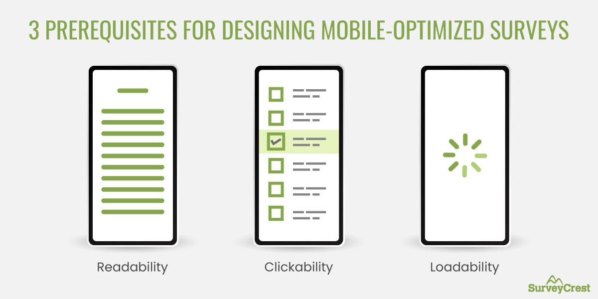
If your survey takes a long time to load or has an embedded video that keeps freezing, it’s not a mobile-optimized survey. You must also remember that some users consume the internet and technology differently than others.
Things like smaller buttons that are hard to click, tiny or embellished fonts with poor contrast that frustrates the mobile user, and anything else that hinders the survey experience is a potential minefield that must be avoided.
To make your surveys mobile-friendly, you have to consider the limitations of mobile screens, slower data speeds, and other bandwidth concerns.
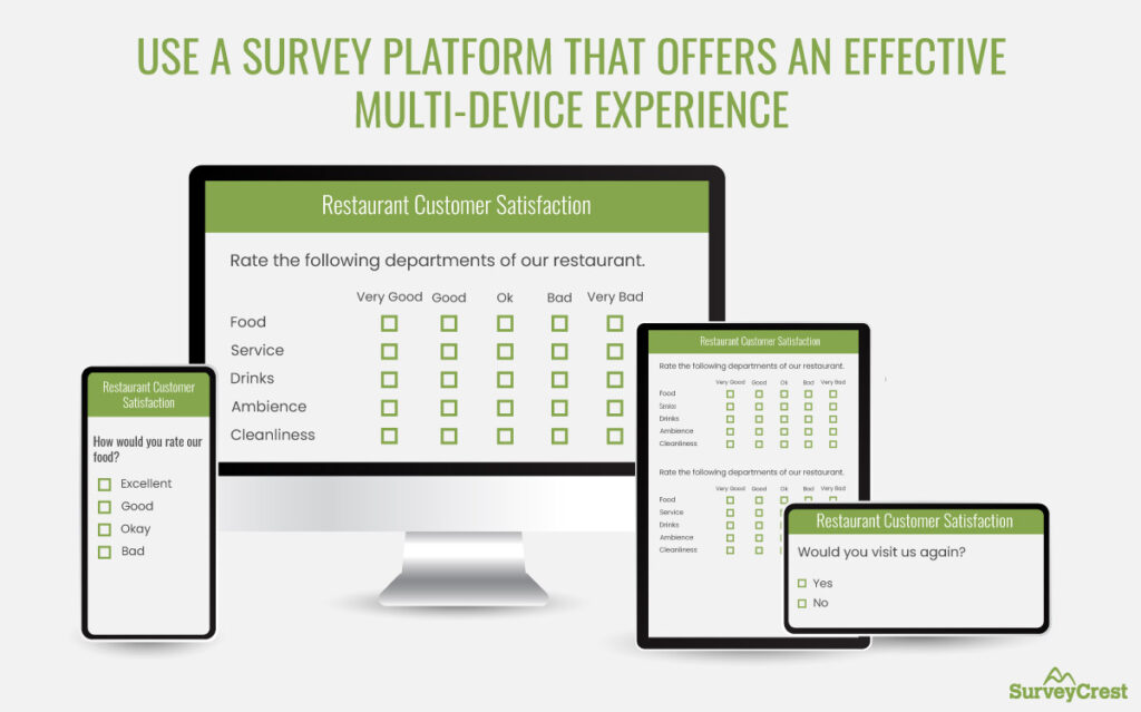
You need a survey-building platform — like SurveyCrest — for business surveys that are formatted and optimized for mobile use.
Meaning, no lines that force you to scroll horizontally or tiny buttons you cannot click. No frustrating zooming and pinching of the screen either.
Instead, you get a custom mobile experience where everything fits the screen perfectly, fonts are easily readable, and buttons can be clicked without accidental taps.
A well-designed survey platform comes purpose-built with mobile optimization features. It recognizes the device type being used to access the survey and responds appropriately by formatting it to work for mobile.
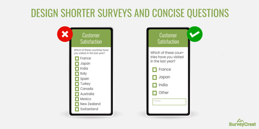
You should aim for brevity regardless of the device type your survey will be on. People love shorter surveys as they are quick to fill in. Your survey abandonment rates decline exponentially for brief surveys and participation rates soar.
Yet, there are times when a shorter survey just won’t do. You need in-depth answers and wide-ranging answers. But those are ill-suited for mobile. When you design a mobile-friendly survey, keep its length short and the questions brief.
Ideally, questions for mobile-optimized surveys should be two lines; max, three. The reply options should not exceed 5 items either. Remember to aim for one question (with reply options) per screen without the need to scroll, and you’re set.
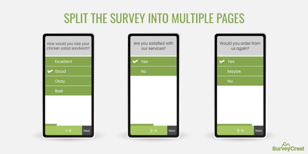
Should you give people the option for a long continuous scroll or force them to go through multiple pages to complete a survey?
Phrased like that, a long continuous scroll sounds ideal. But here’s why it doesn’t work:
When you split the survey into multiple pages, you can save some progress on each survey even when the data speed is not ideal. A 3-5 page survey where each page contains 2-4 questions seems short and quick. People feel more inclined to finish it without losing their focus.
Of all the content guidelines that improve survey quality, the type of questions you’ll add is probably the most relevant for mobile-friendly surveys.
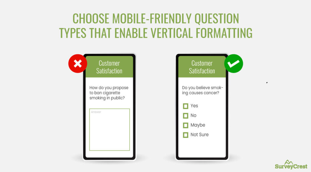
Since you have a limited screen to work with, plus patchy data speeds to consider, multiple-choice questions will be your best bet to go with. Keep the questions short and the number of choice items limited, and most of your survey questions will fit the mobile screens.
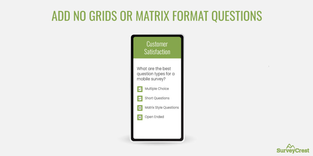
On the other hand, essay questions, matrix-style questions, and open-ended questions should not be used for mobile surveys.
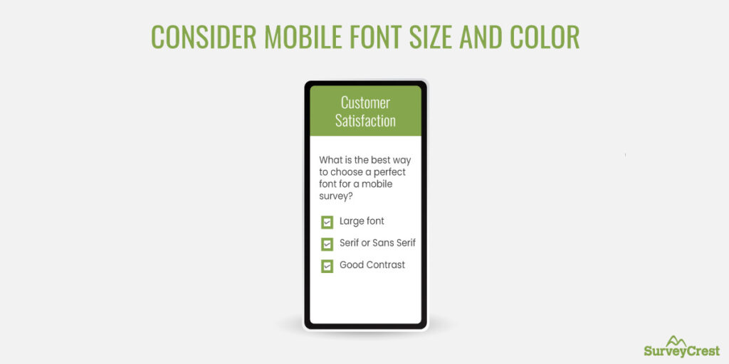
The smaller the screen, the clearer contrast you need for easy legibility. White on black and black on white work best, but most dark colors on a white background offer a decent amount of contrast.
When choosing the font color for your mobile survey, remember to preview and check it on mobile screens so you know for sure what you are up against.
Regarding the type of font you should use, sans serif fonts are ideal, but don’t ignore serif fonts right off the bat. Some, like Merriweather, are designed for digital consumption and offer great legibility even in smaller sizes.
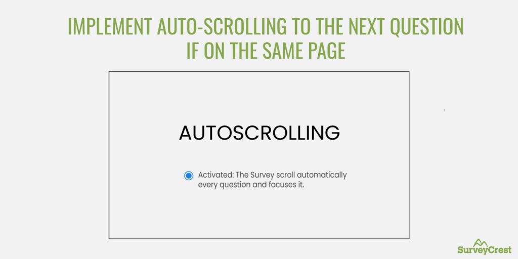
A great feature to add to your mobile survey is to enable auto-scrolling. This feature will automatically take your respondents to the next question when they answer the current one, limiting the need to scroll.
This not only improves the overall survey experience but expedites it too, ensuring respondents can quickly go through the entire thing in less time.
But avoid enabling the auto-continue feature. This feature takes users to the next page of the survey when all on the current page have been answered. But if a respondent has accidentally selected a wrong answer or wants to change their mind, the auto-continue feature makes it a bit difficult.
So, stay with the auto-scroll and continue rocking your mobile survey game.
Speaking of things to avoid when you want to be known as the master of mobile surveys, here are some pitfalls that you should watch out for.
We’ve talked about keeping in mind that some survey respondents may not have the best data speeds to work with.
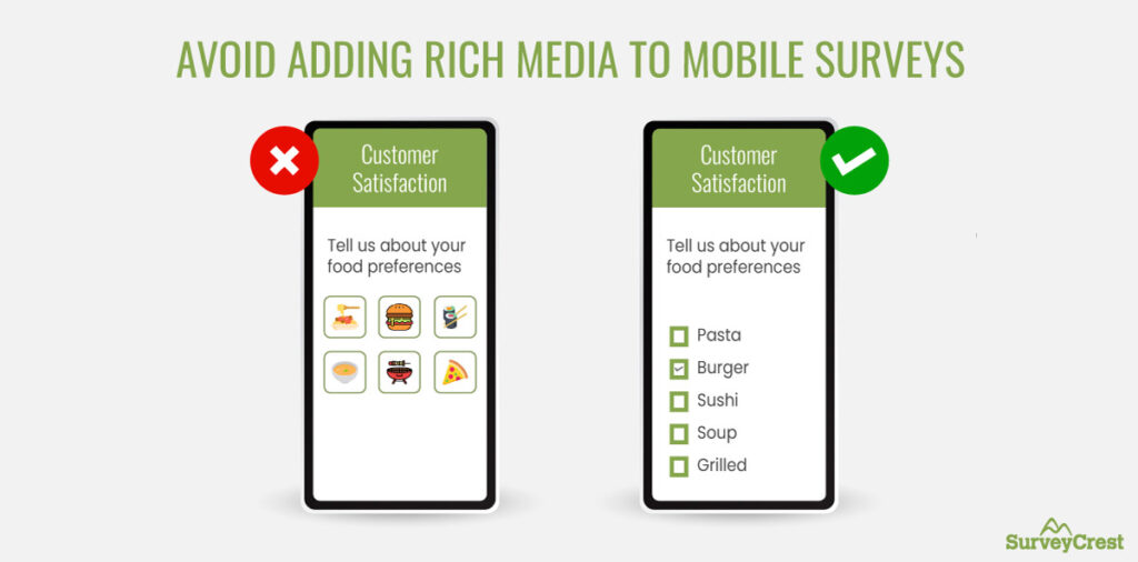
If you add a lot of icons, graphics, images, and videos to your mobile surveys, you are pressurizing slower bandwidths into taking more load than they can handle.
So, keep images and graphics to a minimum in your mobile surveys, and say a resounding No to adding videos.
If you must include videos, consider using a video compressor to reduce file size while maintaining quality, ensuring smoother loading times for respondents with slower data speeds.
When you are looking for deeper insights from your mobile consumers, only a matrix-style question can do the job.
But instead of grouping the questions like in the true matrix format split the questions into multiple separate ones and let respondents answer them individually.
Because if you force them in a group — even in the vertical format — the complexity may force many customers to just quit the survey and leave.
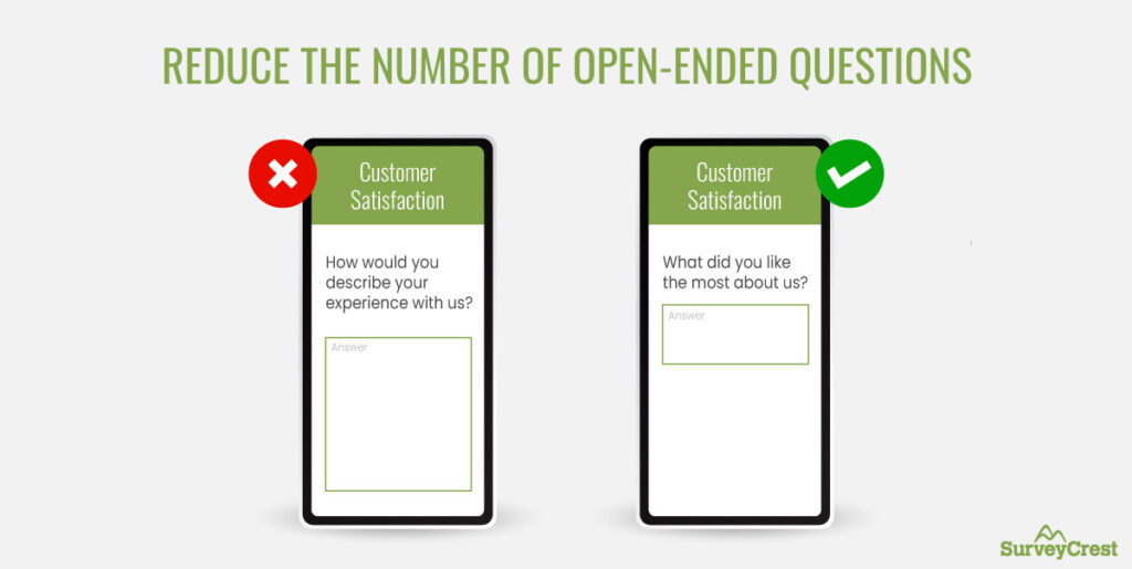
Similar to the matrix format, open-ended questions also have a time and place for mobile surveys. To do right by them, only use them when absolutely needed, and when you anticipate the answer to be short.
For example, you can ask ‘What did you like the most about us?’ because the answer will probably be one or two words long.
But if you include a question like ‘How would you describe your experience with us?’ it can potentially be a long reply. And typing that out on a small mobile screen is probably worth more trouble than your consumers are looking for.
So minimize the use of open-ended questions on mobile surveys, and only include them when necessary.
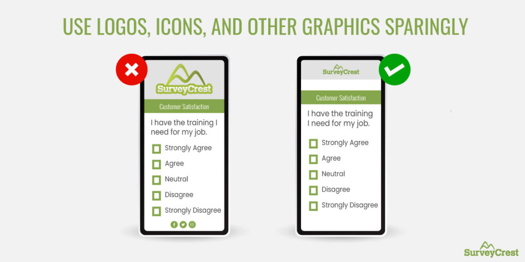
Your brand logo on your mobile survey is a must. As the e-commerce market continues to expand, it’s important to give your consumers a consistent branding experience at all touch points.
But that’s not to say that you should display a huge brand logo on every page of your mobile survey. Add it on the first page and call it a day. The same goes for other graphics and icons, too. Don’t add pictures of different trees next to their corresponding options in the answer. Avoid adding memes with each question when you want to bring humor to your survey.
Keep all of it to a minimum for the most impact and most functionality.
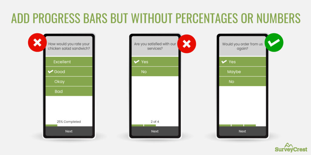
Progress bars are a powerful feature that allows respondents to see how much longer they have to go before the survey is done.
While it’s okay to not have any type of progress indication embedded in mobile surveys, it improves participation rates when you work with it a bit. For example:
Progress bars become more relevant for mobile surveys longer than 3 minutes. If your survey length is 5 or 7 minutes, for example, adding a progress bar can significantly reduce survey fatigue and keep users attentive.
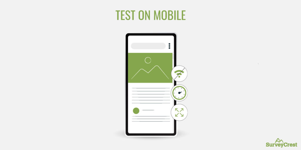
Don’t forget to test your mobile surveys, but most importantly, don’t forget to test them in the right environment.
When you design a survey intended for a multi-device audience, test it in contextual environments. In addition to desktop, test it on mobile too. Use an Android and iPhone mobile to see how the survey responds to the differences in each environment, then choose the solution that’s equally beneficial for both.
Don’t ignore your mobile audience as you create customer surveys to learn what your people have to say about you.
Use SurveyCrest today to create fully customizable mobile-ready surveys for your consumers that are on the move.
Kelvin Stiles is a tech enthusiast and works as a marketing consultant at SurveyCrest – FREE online survey software and publishing tools for academic and business use. He is also an avid blogger and a comic book fanatic.